Escher’s Job Scheduler

Normally, PHP is very poor at handling large, complex operations. PHP has no concept of “out-of-band” or “asynchronous” processing, so everything is processed within the scope of the current request:

1. A user makes a request to the web server.
2. PHP parses and executes the requested script and all included scripts in their entirety.
3. The web server returns the results of the PHP script to the user.

The larger or more complex the logic is, the slower Step 2 gets. This can become painfully obvious to the user when a “blocking” operation occurs–a large file is created, compressed, or encoded, a call to an API or remote server is made, etc.  Worse for PHP is the particular way that PHP, Apache, and other common components of the server stack handle multiple requests.  In certain cases, if one user is waiting on a “slow” request, many other users may experience slow responses.

Escher’s new job scheduler is designed to alleviate this problem. Instead of performing a “blocking” operation during a request, a script can create a job to perform the operation asynchronously, after the request has completed.  Jobs can be set to run at some point in the future, but often, they are “scheduled” to be processed immediately.

Escher accomplishes this by making use of the Linux command-line interface.  When a job is created, Escher sends a command to the command line that starts the job scheduler process.  This process is non-blocking and exists outside of the current request.

This way, the request can complete quickly and send a response to the user.  The background job has not completed at this point, but the response can provide feedback to the user: “Check back in a few minutes.”

A more sophisticated response might utilize Ajax to check the status of the job periodically.  Here again, Escher’s job scheduler can come in handy.  As the background job process, the scheduler collects information about the status of the job–error messages, return status (success or failure), and more.  The job itself can even save progress information, human-readable messages, and other data to the database.

There are plenty of other features I want to add to the job scheduler–especially configurability, e.g., the ability to disable automatic processing (depending instead on a system cron) or pinging one or more separate “job servers” in lieu of local processing.

Posted in (Unfiled) | Leave a comment

Years of Mess

I’ve taken some time to update a few of my old websites and projects that I’ve had a hand in. Now that they’re slightly less embarrassing, I thought I’d share them.

My Bloghttp://www.thomshouse.net
– Import of Embarrassing LiveJournal entries? Check.
– Consolidation of two previous WordPress blogs? Check.
– Google+ Importer? Check.
Theme that I am, at least for the moment, a little proud of? Check.
I had been saving the “nature” theme for a portfolio website, and was never really happy with the “blueprint” version of the theme that I had used for my last blog. So I relented and switched to the colorful nature theme, which I really do love. Hopefully, between the new theme and the G+ imports, I can make a halfway decent attempt at “blogging” once again.

Smart Popcornhttp://www.smart-popcorn.com
For so long now, I’ve had good intentions of remaking this website, but truthfully I’ve lost interest in the subject. I owe a lot to this site, though. To build it, I taught myself PHP and MySQL, so it is directly responsible for my current job and my career. I made some minor visual tweaks to the background (which I have now dubbed “finely-textured popcorn” so I am willing to show it in public again. ;)

Adelaide Videohttp://www.adelaidevideo.com
Barebones as sites go, but for its age, I’m pretty happy with the design. A much softer, more textured and perhaps feminine site than I have built before or since… Also one of the first designs for which I made important use of proportions (golden ratio, cinematic ratio), and a precursor to my obsession with leanback interfaces and responsive design. (See also: http://www.edtv99.org). Six years ago, I thought it was too awesome to use CoralCDN for serving video. Last week, I decided it was time to switch to Vimeo. :P

Linodehttp://bit.ly/ThomsLinode (Referral)
I finally moved all of my sites (and most of my friends’ sites) over to my Linode box. My past experience was with a GoDaddy box, so I am thrilled with how much control I have over the server, how easy it is to configure (via a free control panel I found), and what a beast it is for just having 512MB of RAM. Highly recommend Linode to anyone who is comfortable with Linux and wants a nice, standalone virtual server.

It’s nice getting all of my old sites and projects updated and/or cleaned up a bit. Refreshing. Also nice to dip my toes in the visual-design side of things, if only just slightly. (Lately it’s all been backend logic.) There are a few other designs I would like to work on, so maybe I’ll post a follow-up. :)

#thomshouse

Posted in Google+ Posts | Leave a comment

Cloud Hosting versus Dedicated Hosting

Earlier today, .net magazine (@netmag) asked the Twitterverse if “cloud hosting” was simply a new buzzword for dedicated hosting, or something different.  I replied:

“It’s certainly different, but requires more know-how and the difference won’t be felt by 90%+ of those who would consider it.”

I don’t want to post a lengthy article, but I thought I would try to back my claim with a little bit of math.  Fair warning: this is common-sense math that might not hold water in real-life situations (somewhere between damned lies and statistics?) so you are forewarned.

Cloud hosting differs from “normal” hosting in that the host services are distributed across multiple servers. In theory, something as simple as running a web server alongside a separate database server could be considered a form of “cloud”.  However, the typical selling point of cloud hosting is extreme scalability–that you quickly expand your website to run on many servers at once, and later turn off or simply discard spare servers when they are not needed.

This is a very attractive option for large sites and web services, as traffic–and thusly bandwidth, CPU and other resource usage–varies widely by time of day, and by day of week. The traffic to any given website in a 24-hour period resembles something like this:
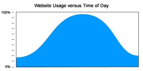
Consider a website that requires ten servers to operate at peak usage.  Cloud hosting seems like a very nice option:
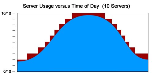
During non-peak hours, the website can run on as few as two servers.  By not having to pay for the remaining servers when they are not needed, the website can save a significant amount of hosting costs.

However, these advantages of cloud hosting are not as great for smaller operations.  Consider a smaller website that only requires two servers to operate at peak usage:
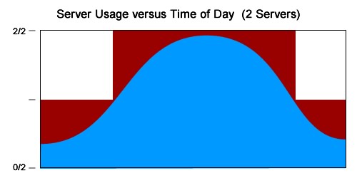
For a smaller website like this, cloud hosting provides far less control and with far greater risk.  The operator of the website must make a choice: turn the second server on early and incur additional hosting costs, or delay turning on the second server as long as possible, and risk site performance issues.  And because the required “turn-on” point occurs when traffic is climbing at its fastest, the risk of performance issues is a very real thing.

Still, there will be a period of time at which the website simply will not need a second server.  The website operator must decide if that downtime will result in actual savings over a traditional virtual dedicated hosting plan.

To get a very rough idea, I have specced out comparable plans between a GoDaddy VPS and a “cloud” of two Amazon EC2 “small” servers:
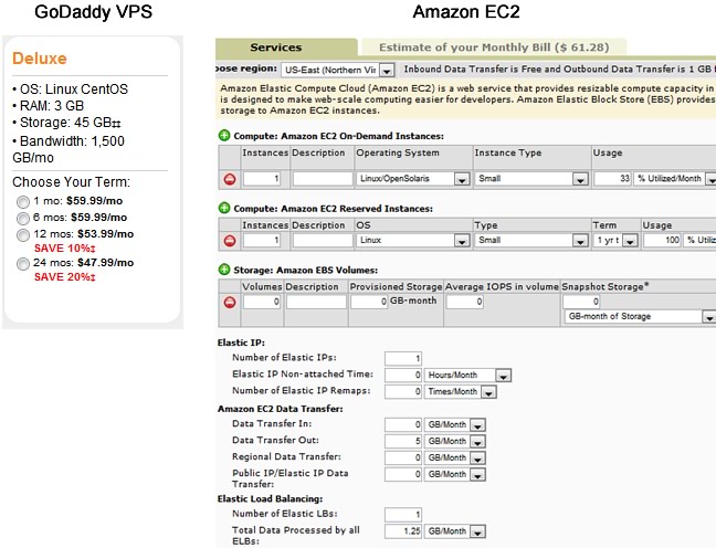
I tried to give Amazon every possible advantage in this case–I’ve neglected to take GoDaddy’s 12-month discount into account, and I’ve specified an extremely low amount of data transfer for a website that would require such a meaty hosting plan.  Even still, the EC2 solution is only competitive in price if the second server sees 33% or less utilization. And were I to expect greater bandwidth requirements, Amazon’s cost quickly becomes much more expensive.

There are costs to cloud hosting well beyond dollar amounts, as well.  Upgrading to a “cloud” environment introduces many new layers of complexity–load balancing, instance management, network file handling, and much much more.  Amazon’s administrative console is extremely powerful and helpful, but even still, the learning curve can be incredibly steep.

I don’t mean to make a case against cloud hosting.  It really is an amazing tool for an organization that needs to scale, and scale big.  I would simply caution this:

Do not overestimate your need for cloud hosting.

If you are first and foremost a web designer, and you aren’t what you would consider a “server guy”, cloud hosting is probably beyond your needs and will definitely overwhelm you.  If you are more savvy, or are in a large enough organization to have one of the aforementioned “server guys”, block out a good amount of time for learning in-depth about cloud hosting and developing a plan for when and how to best implement it.

P.S. I also don’t mean to paint Amazon in such a poor light.  I use them as an example simply because they are the best cloud example.  For reasons greater than simple math concepts, I would still recommend an EC2 a million times over a GoDaddy VPS.  (I would simply not recommend a GoDaddy VPS, period.)

For anyone who cares, these are my personal recommendations for choosing virtual/cloud hosting.

  • Avoid GoDaddy. The numbers are very competitive, but in my experience their servers are extremely inundated by “bloat”.  I suspect they also spread CPU resources very thin.
  • Avoid the Amazon “Free Tier” EC2. This may seem like a great starter solution for web hosting, but there are often hidden costs related to disk usage. Consider this option only for testing the Amazon platform.
  • For small servers, consider Linode. This is where I currently reside.  The numbers on its pricing plans seem less competitive than GoDaddy, but the quality of the hosting service and environment is top-notch. (Disclaimer: If you sign up via the link above, I will receive a referral in the form of a discount. This does not affect my opinion of Linode, but I can most certainly appreciate discounted hosting costs.)
  • Watch the Amazon Large EC2. When you can afford it, or when your website starts to outgrow something like the Linode 1536, jump to Amazon and settle in on a Large EC2.  At this size, I feel Amazon becomes far more economical than any other option.  You still don’t need cloud computing yet, but when you do, you’ll be on a platform that’s more than capable for doing so.
Posted in General | Leave a comment

iPhone or Android?

Lately, I have been asked one question more than any other question–heck, more than all other questions combined: “What phone should I buy?”  Part of my day job is spent supporting computers, browsers, email, and network connections…  And yet no one asks me about those things in passing.  It’s always about phones.  Nearly a decade after we first chuckled over the weird guy obsessed with his oversized CrackBerry…  We’ve all caught the addiction.  This is the era of the smartphone.

So…  What should you buy?

Forget about BlackBerry and Palm.  They have missed the window of opportunity for attracting developers, and a smartphone without software…  just isn’t very smart. Microsoft has actually done some interesting things with the Windows Phone 7 user experience, but I would consider its new OS an “unknown” for the time being, as Microsoft has a tendency to produce neat gimmicks with very poor follow-through.

Really, then, this becomes a simple either/or scenario: “iPhone or Android?”

Of course, to many technology fanboys, that is no simple question, but rather, fuel added to the fire of their latest holy war.  Apple hipsters will tout the iPhone’s ease-of-use; Google advocates will mention the open platform.  iFans will brag that their demographic gets laid more, and Droid-heads will…  Mention some cryptic thing about how nice “user intents” are, whatever that means.

I guess my overlap of fandom–I love my MacBook Pro, but I eat and breath Google Apps–has left me in a position to offer a fairly objective opinion: It really comes down to what your needs are.  There are a few very important questions that should guide your decision, and otherwise it simply comes down to preference.  Those questions, in order of importance, are as follows:

  1. Do you have a deep-seated hatred for AT&T? I couldn’t blame you…  Their logo, until recently, did bear an uncanny resemblance to the Death Star.  All signs point to Apple breaking free from its bonds with AT&T in the near future, but for now…  Go Android.
  2. Is it important for you to have music, movies and photos with you on the go? Apple’s experience with iPods and iTunes give it a clear advantage, although Google is making plans to catch up in the next version of its OS.  Still: Go iPhone.
  3. Do you rely on Google’s Gmail, Documents, Calendars, and other Google Apps? Fortunately, most of these apps perform equally well (or poorly) on both platforms.  However, Apple has been known to block some Google apps in the past, and there’s nothing stopping them from doing so again in the future.  And of course, nobody is going to know Google Apps–and Android–better than Google.  Go Android.
  4. Is important for you to be able to customize and personalize your phone software and user experience? Apple likes to control the user experience, so they don’t allow apps to take over any of the default functionality of the phone.  Tired of the default iPhone SMS interface?  There’s an app for that–but good luck getting it to use your unlimited texting plan, or accessing it from your Address Book contacts.  Android, on the other hand, gives users the freedom of choice.  I run a custom home screen, lock screen, and SMS app.  I have multiple map apps, browsers, and camera apps installed, and could easily set one of them as the “default application” for those duties.  All of these apps, and the many UI elements provided by the Android OS, interact and play nice together.  This is my single favorite feature of Android, and I wish there were a desktop OS that handled these interactions so elegantly.  Granted, most people don’t require this level of customization.  But if you’re a tinkerer…  Go Android.
  5. Is it important for your phone to be extremely simple to use? Android has gotten knocked for having a less-than-elegant UI, but as of “Froyo” (version 2.2) I believe it is nearly as clean and user-friendly as the iPhone’s.  I say “nearly”…  Apple is the king of polish, and there are certain specific actions (e.g. selecting text on a web page) that are still just a million times easier on iPhone.  These are features you won’t realize are missing on an Android phone until you need to use them–and many people never will.  But if you want a stupidly simple smartphone, and I mean that in a good way: Go iPhone.

There are many extenuating circumstances that can trump this list, of course: carriers, coverage, keyboards, form factors…  Android, being on multiple phones and carriers, is a bit more accommodating to these circumstances.  But really, if you didn’t answer “yes” to one of the questions above, it comes down to user preference.  If that’s the case, then congratulations are in order…  Hopefully, whatever choice you make, you can remain a somewhat neutral party, avoiding the fanboy wars that will continue for a few years to come.

Caveat emptor: Android mileage varies greatly by phone manufacturer and carrier.  Android phones from T-Mobile or from Motorola’s Droid series are generally safe, HTC-branded phones have some rather invasive UI customizations. The Samsung Galaxy line of phones have made waves as the “alternative to iPhone”, but in a cruel twist of fate, some stock Android features are just plain broken in the Samsung UI.  And some cheaper phones are simply underpowered.  In lieu of writing an article about “Which Android phone should I buy?”, I will happily do my best to field any questions left in the comments.

Posted in General | Leave a comment

Textpandable: jQuery Expanding Textarea Plugin v0.9

Just wrote my first jQuery plugin!  Textpandable is a plugin that enables textareas to auto-resize to fit content.  Just load jQuery and Textpandable, and include the following Javascript:

$(‘textarea’).textpandable();

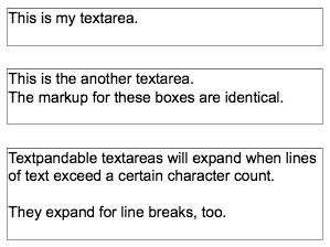
…and voilà!  All of your textareas are expandable, like this:

Textpandable in ActionTextpandable offers the following options:

  • lineHeight: Specify the lineHeight of the textarea–as a Textpandable option or a CSS declaration.
  • minRows and maxRows: Set limits to how small or big your textarea will expand to.
  • padding: Set a number of extra rows to provide for “padding”.  1-2 rows is usually a good value.
  • width: Number of characters to allow per line before adding an extra row.  If not set, Textpandable tries its best to determine safe values based on CSS declarations, col attributes, and/or pixel width.

Now, I’m calling this version 0.9 for a few reasons:  I haven’t tested this in IE yet, and I haven’t documented the code (although it’s really simple)…  but most of all, it’s not feature-complete: I want to get animations working.  Unfortunately, with animations turned on, any change in size causes the cursor position to skip to the end and/or lose focus.  I’m not experienced enough with the innards of jQuery to know why this would be happening.

It works just fine with the default speed setting of ‘0’ (as I’ve short-circuited the animation script in this case).  Anyone who gets animation working will be my hero!

Download Textpandable v0.9 (Dual-Licensed MIT & GPL)

Posted in General | 5 Comments

Quantum Theory of CSS Image Rollovers

I’m working on the redesign for my beloved first-born child, SmartPopcorn.  The previous design iteration is nearly four years old, so needless to say, the new design is a big, big change with a lot of design features that weren’t even available–or that I certainly wasn’t aware of–four years ago: CSS selectors, min-width and max-width, position: fixed… And thank the maker, IE7 and IE8.

During this redesign, I realized two things: First, I take a different approach to CSS image rollovers than most people seem to.  Second, my unorthodox approach really came in handy this time.

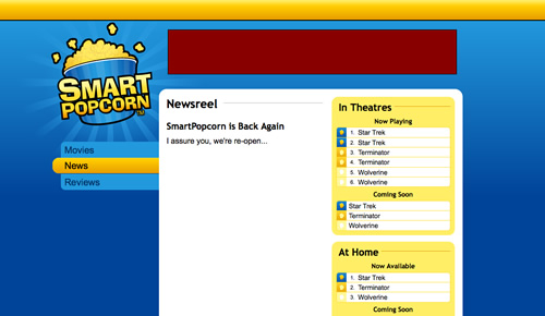
Here’s a screenshot of what the new design looks like:

New SmartPopcorn

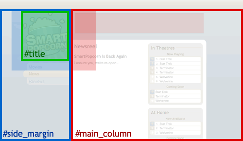
It’s a semi-fluid design that’ll stretch anywhere from 1000 to 1200 pixels and, beyond 1200 pixels, will remain centered in the window.  There are also a number of different background images stitched seamlessly together to provide both the full-width gradient and the starburst pattern behind the logo.  Here’s an outline of some of the major layout elements:

Elements of The SP Design

The outlines represent the dimensions and positioning of each element, and the shaded portions represent the background image position.  It looks relatively simple, but there were a lot of difficult issues involved–either the starburst pattern was getting cut off to the left, or the main content area was too skinny, or something. The CSS image rollover for the bucket logo was actually the least of my concerns–but only by happy accident.

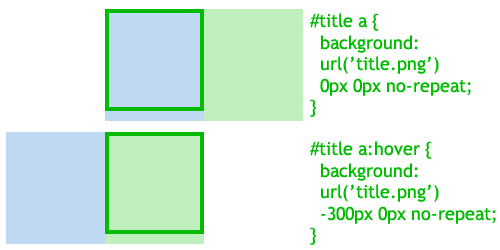
The “holy grail”, and most common implementation of CSS rollovers is the single-image rollover, illustrated below:

Single-Image Rollover

Typically, the background image contains two “sprites”, and you manipulate the background position to display either the default or active sprite, one or the other.  This works just fine, and I think it taps into the visual metaphor of the “sliding door” that is so popular among CSS gurus.

However, I’ve always done my rollovers differently.  (When don’t I do things differently?  It must be because I’m self-taught.  “Never had one lesson,” as Ferris Bueller would say.)  Take a look:

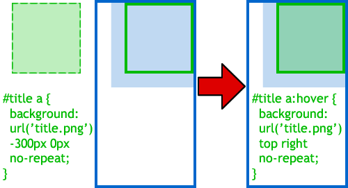
Quantum Rollover

Here we have two HTML elements: the #title link, which will be on the receiving end of our rollover; and its parent element, the #side_margin div.  I’ve always just made the background image of the parent element handle the default state of the rollover.  Meanwhile, the background-image of the #title element is positioned out in la-la land, in negative-pixel territory…  out of sight.  When the #title’s :hover state is fired, its background-image is repositioned into view.  Tada, rollover.

I call this the “quantum rollover” because, well, it really doesn’t exist until you observe it, right?  Geeky, I know.

Is this approach better or worse than the “traditional” CSS rollover?  I’m not sure.  I think it’s better in some cases, worse in others.  I do think my approach has an advantage if your parent container is already going to include a background image–as is the case with the starburst pattern in the SmartPopcorn design.  I also think that, because I’ve approached my rollovers this way, it’s helped me to keep my designs smoother, softer, and less claustrophobic or “boxy”.

What do you think?

Posted in CSS | Leave a comment

GoogleFail and the Cloud: Bring it on.

It seems that the talk of the week this week was the massive GoogleFail.  I will refrain from rehashing my “post a corporate logo on the fail whale” shtick today, because I don’t seem to be as downcast about it as everyone else.  In fact, this is one more reason why I love Google’s services, and the cloud concept in general, and why I say, “Bring it on!”

We'll be back soon.What?  You think I want four hours of slow Web sites?  Of inaccessible Gmail?  Nosiree.  I hate the thought!  But here’s another thought:  Email goes down, doesn’t it?  Whether it’s Gmail, or POP, IMAP, or Exchange, sooner or later, we experience a little downtime.  It happens.  Of course, when you have to call someone and say, “Sorry, I didn’t get your email, my corporate Exchange server is on the fritz…”  That just sounds bad, doesn’t it?  Looks bad for your company, and for you.  Google?  Well, that’s another story.  Nobody could blame your company for going with Gmail, because it’s a great deal.  And when the shit hits the fan, nobody’s going to look down on you because somebody at Google screws up.  (Unless you work for Google.)  And as we can see this week, EVERYONE will know when Google screws up.  So, in a sense, Google gets to play the patsy and subsidize our would-be embarrassments.  No longer is it Joe in IT’s fault…  It was the GoogleFail, you know, the one all over the news.

Which, might I add, is silly.  This should hardly be newsworthy.  I’ve been on Gmail for more than four years, and in those four years I cannot recall more than eight hours in which Google has been less than 100% operational.  That’s about 99.978% availability, and I would consider that a conservative estimate, as many accounts were probably still freely available during those incidents.  (I have never personally felt the effects of ANY of Google’s outages.)  That’s at least as good as my web host, it’s at least as good as my email at work (probably significantly better if you’re counting slowdowns as downtime), and it’s probably about as good as the small server cluster my team runs at work, which has far more redundancy than it even has points of failure.  So Google (and by proxy, “the cloud”) is at least as reliable as non-cloud technology…  It provides everywhere access and features (such as collaboration and interoperability) that local technology typically can’t touch.  And as previously established, when it IS down, it’s not your fault.  How is that not a win-win situation for everyone?

So yes…  I say bring on the cloud: slowdowns, GoogleFails, and all.

Posted in General, Programming | 1 Comment

“Voodoo Child” CSS Reset v1.0

I developed my own CSS reset a while ago, and I’m pretty happy with how it’s working, so I thought I’d share it.

The concept of a “CSS Reset” is embarrassingly new to me–I only read about them a month or two ago.  Of course, 90% of what a reset does, I have done manually for years, but I stupidly never thought of separating the styles out that way.  When I read about resets, I was initially turned off because many of them seem way too aggressive.  (Upon searching for validation, I indeed found that it I wasn’t the only to dismiss resets as a bad thing.)

I’m a stubborn person, but fortunately I seem to be capable of talking myself out of stubborn positions.  A week or two back, I decided to try out the use of a reset, to see (A) if I liked the setup, and (B) if it seriously borked any of my recent work.  Looking around, I didn’t find any that did exactly what I wanted a reset to do.  The closest was a reset unofficially credited to Shaun Inman, although it appears to be itself modification of the popular YUI reset.  It was as good a place as any to start, so I began to flesh out my own personal reset script.  Here’s what I came up with:


/* "Voodoo Child" CSS Reset by Thom Stricklin. Based on W3C defaults, YUI and work by Shaun Inman. */
body,div,dl,dt,dd,ul,ol,li,h1,h2,h3,h4,h5,h6,
pre,form,fieldset,input,p,blockquote,table,th,td,embed,object {
padding: 0; margin: 0; outline: 0; }
table { border-collapse: collapse; border-spacing: 0; font-size: 1em; }
fieldset, img, abbr { border: 0; }
address, caption, cite, code, dfn, th, var { font-weight: normal; font-style: normal; }
caption, th { text-align: left; }
h1 { font-size: 2.0em; }
h2 { font-size: 1.50em; }
h3 { font-size: 1.17em; }
h4, h5, h6 { font-size: 1.0em; }
h1, h2, h3, h4, strong, b { font-weight: bolder; }
h5 { font-weight: bold; }
h6 { font-weight: normal; }
q:before, q:after { content: ''; }
a, ins { text-decoration: none; }
sub { vertical-align: bottom; font-size: 0.67em; }
sup { vertical-align: top; font-size: 0.67em; }


/* Slight Return. These settings are more likely to change from project-to-project. */
h1,p,blockquote { margin-top: 0em; margin-bottom: 0.5em; }
h2,h3,h4,h5,h6 { margin-top: 1em; margin-bottom: 0.5em; }
ul, ol, blockquote, dd { margin-left: 5ex; }
.block-list li { list-style: none; }
.inline-list li { list-style: none; display: inline; }

A few things my reset does differently:

  • This is a reset…  and then some.  The new rules I set are too modest to consider a CSS framework by any means, but they do go beyond a standard reset.  For those who would prefer just the reset, just take out everything after the “Slight Return”. (Yes, I am a dork.)
  • I do not set all headers to 1em.  Rather, I went with a mix of the W3C “default” values and a little common sense: It’s pointless for H5 and H6 to be smaller than 1em so, instead, I decrease their font-weights.
  • I treat H1 differently than other headers.  The train of thought is that H1’s will most likely appear at the top of the page, and so will not require a top-margin value.  H2’s and beyond will appear in the middle of page content and will probably look better with some extra separation.
  • I do not reset the default list styles.  Lists-as-layout are very popular now and rightfully so, but they’re still great for normal lists–like this one–too.  I do provide “block-list” and “inline-list” class declarations for quickly & easily achieving headless lists.  I’m not sure how useful they are, though…  I’ve already encountered a case of a list that will be displayed as block for screens, but inline for iPhone/mobile.
  • I fiddle with the display of sup/sub tags.  This behavior is out there in other reset scripts, but unfortunately I did not save my source for this partiicular solution…  Sorry!

I hope this reset script might be of some use to others.  More importantly, I hope this might help to open some minds about reset scripts.  They really are just a set of tools we each can choose to use…  or not use.  But we can forge our own tools.  We can write our own resets to our liking, so why not?

Posted in Design, Technology | 1 Comment

Firefox: Move Aside and Let the Web Go Through.

There has been a little buzz lately about what the next version of Firefox should look like, and it’s certainly different.  The latest idea seems to put the tab, and tab-like items such as apps and workspaces, in the sidebar.  It’s either innovative, or an ode to iTunes, depending on who you’re talking to.

I personally oppose making our browsing experience dependent upon “workspaces” or categories…  It would take too much work for everyday browsing, it’s presumptuous to expect it would actually match most people’s browsing patterns, and it’s only adding another layer of organization to the browser, as tabs (or whatever tabs become) are still in there somewhere.  Workspaces could be useful for advanced users, but let’s not build our browser around them.

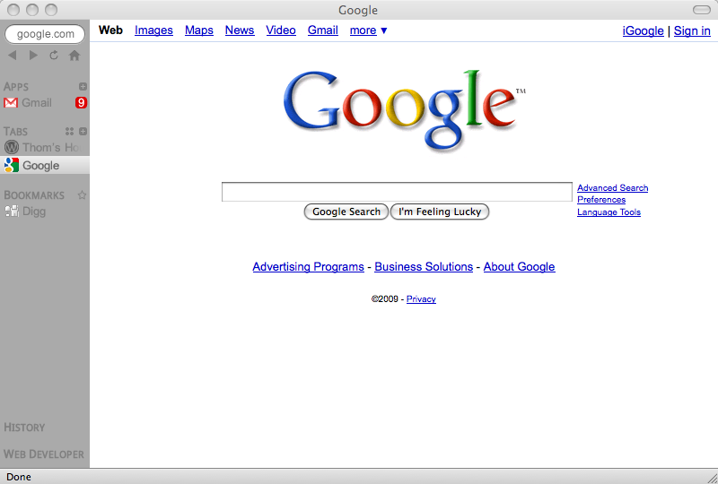
I do, however, like the general trend towards moving things into the sidebar.  As I commented on Mozilla designer Aza Raskin’s blog, there are many reasons to consider this a good move.  In fact, I say let’s take things to the next step and move the entire browser UI into the sidebar.  I spent an evening in Fireworks layout out such a design, and here’s what I came up with:

Firefox.Next?

I probably went just a bit too extreme on how compact I made the sidebar (which of course, ought to be resizable anyway) but I wanted to drive home the point: done right, this exodus to the sidebar can improve simplicity, usability, and aesthetics.  The sidebar is the new awesome bar.  I’ll break things down by component:

  • Address Bar/Awesome Bar: Firefox (and Chrome, too) have gone a long way to making the address bar more useful, and ubiquity will take us even further down that road.  But there’s still one big problem: it’s a real-estate hog.  Most of the time, if I ever even type in an address these days (more likely I’m following a link or a book mark), I just type, press enter, and forget about it.  Why is it constantly hovering over my window?   When it doesn’t have focus, it should condense down and slide into the sidebar.  Give my web page the full height of the screen to work with.  When you click into the space–boom–it slides back out for you.  It might also be a good idea to provide a delete button on-hover (a la OS X/iPhone search fields).
  • Back, Forward, Reload/Stop, and Home: The only four buttons we need.  Even in the current Firefox incarnation, these would easily fit into the sidebar, so why not?
  • Apps: Not sure where this idea originated, but it was on Aza Raskin’s mock-up, and I think it’s a great idea.  I hope these are not just “supertabs” in that they stick to the top, but that they provide additional functionality: Available in all windows, always open in the background, personalize the name in sidebar, etc.  I think the option to “maintain a separate cookie/session” for an app would be a neat idea too, as we could then maintain a “Personal Gmail” app and a “Work Gmail” app running without interference, and without the need for an addon.  I also think that Mozilla, Google, and Apple should work together on some sort of web application notification system (some extension of the dom or the navigator object).  As we think of web sites more and more as applications, we need to have the level of interactivity that we’d have with desktop apps, and flashing a message in the title attribute just doesn’t cut it any more. We should have both numeric notifications (i.e. 9 new messages, as pictured above) and Growl-style textual notifications.
  • Tabs: Not much to this, except I do think it’s important to give users a “show all tabs” button.  Let’s not be so concerned about doing things “the Firefox way” (differently) that we fail to acknowledge a good user interface element when it comes around.
  • Bookmarks, Feeds (Not Pictured), History, Addons: What’s great about this sidebar approach is that it really unifies the interface.  All of these components can look the same and function in the same or similar manner.  It also leaves it so that browser components are competing with each other for real-estate, not with the page content.  I envision most of these components (except bookmarks) being collapsed by default, and expanding on-click accordion-style.  They can either take up as much space as they need, or take over the whole sidebar, collapsing the other components.  But once you click away from the sidebar, they collapse again.
  • Themes/Styles: I know absolutely nothing about the current means of theming Firefox, but make this sidebar CSS-driven and I could create an entirely new theme from scratch in about five minutes.  In fact, we could build customization into the browser (think similarly to Twitter’s interface) and let users set their own colors, backgrounds, etc.

A word of caution: let’s not throw out the baby in favor of trendy new bathwater.  In my experience, most Firefox users do not use 20 tabs at once.  They do not keep certain pages open, app-style, at all times.  They’re perfectly happy with the current user interface, and if we completely abandon it, they will balk and move to Safari or Chrome or even IE8 for a more familiar experience.  (See: Winamp.  How many of us switched to iTunes when the ridiculous Winamp 3 UI came out?)  So we need to think out a way to make this new UI work both ways, and probably give users the option when they upgrade: UI elements at top (Firefox 3) or on the side (Firefox 4).

That said, if the next version of Firefox resembles this in any way, I will be eagerly awaiting the 4.0 beta.

Posted in Design, Technology | 6 Comments