I’m working on the redesign for my beloved first-born child, SmartPopcorn. The previous design iteration is nearly four years old, so needless to say, the new design is a big, big change with a lot of design features that weren’t even available–or that I certainly wasn’t aware of–four years ago: CSS selectors, min-width and max-width, position: fixed… And thank the maker, IE7 and IE8.
During this redesign, I realized two things: First, I take a different approach to CSS image rollovers than most people seem to. Second, my unorthodox approach really came in handy this time.
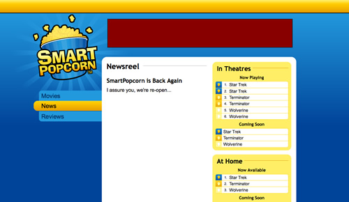
Here’s a screenshot of what the new design looks like:
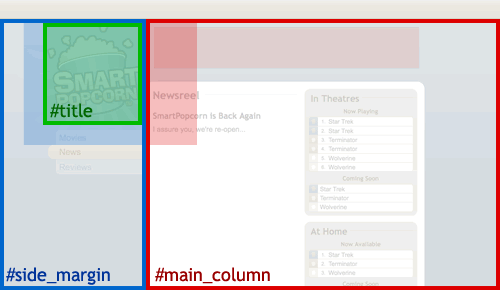
It’s a semi-fluid design that’ll stretch anywhere from 1000 to 1200 pixels and, beyond 1200 pixels, will remain centered in the window. There are also a number of different background images stitched seamlessly together to provide both the full-width gradient and the starburst pattern behind the logo. Here’s an outline of some of the major layout elements:
The outlines represent the dimensions and positioning of each element, and the shaded portions represent the background image position. It looks relatively simple, but there were a lot of difficult issues involved–either the starburst pattern was getting cut off to the left, or the main content area was too skinny, or something. The CSS image rollover for the bucket logo was actually the least of my concerns–but only by happy accident.
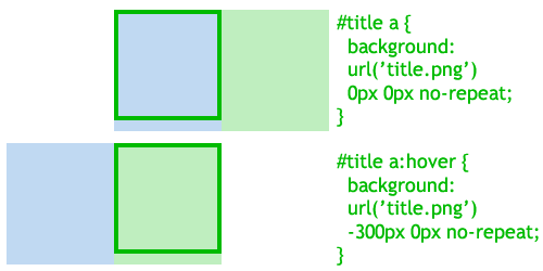
The “holy grail”, and most common implementation of CSS rollovers is the single-image rollover, illustrated below:
Typically, the background image contains two “sprites”, and you manipulate the background position to display either the default or active sprite, one or the other. This works just fine, and I think it taps into the visual metaphor of the “sliding door” that is so popular among CSS gurus.
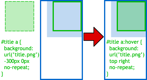
However, I’ve always done my rollovers differently. (When don’t I do things differently? It must be because I’m self-taught. “Never had one lesson,” as Ferris Bueller would say.) Take a look:
Here we have two HTML elements: the #title link, which will be on the receiving end of our rollover; and its parent element, the #side_margin div. I’ve always just made the background image of the parent element handle the default state of the rollover. Meanwhile, the background-image of the #title element is positioned out in la-la land, in negative-pixel territory… out of sight. When the #title’s :hover state is fired, its background-image is repositioned into view. Tada, rollover.
I call this the “quantum rollover” because, well, it really doesn’t exist until you observe it, right? Geeky, I know.
Is this approach better or worse than the “traditional” CSS rollover? I’m not sure. I think it’s better in some cases, worse in others. I do think my approach has an advantage if your parent container is already going to include a background image–as is the case with the starburst pattern in the SmartPopcorn design. I also think that, because I’ve approached my rollovers this way, it’s helped me to keep my designs smoother, softer, and less claustrophobic or “boxy”.
What do you think?


